The CSS Flexbox Model
The flexible box layout module, usually referred to as flexbox, is a one-dimensional layout model designed to arrange elements in a container with flexible and efficient space distribution. It allows for the automatic adjustment of size and position of items in a container.
The flexbox model is called one-dimensional because it only allows for the positioning of elements on one axis at a time - either the main axis or the cross axis The main axis is defined by the flex-direction property, with the cross axis running perpendicular to it.
The main axis
The main and cross axes of a flex container are defined by the flex-direction property. There are four values it can take on:
rowrow-reversecolumncolumn-reverse
flex-direction property is set to row or row-reverse, the main axis will run along the horizontal line.

If the flex-direction property is set to column or column-reverse, the main axis will run along the vertical line.

The cross axis
The cross axis runs perpendicular to the main axis. In the case of the flex-direction being set to row or row-reverse, the cross axis will run down the columns.

If, on the other hand, the flex-direction is set to column or column-reverse, the cross axis will run along the rows.

The flex container denotes an area of a web page to be designed using the flexbox model. A flex container is created by setting an area's display property to flex. This will turn all of the element's direct children into flex items.
As with all CSS properties, there are some default values the flex container will take on when its properties' values have not been specified. A newly created flex container will behave in the following way:
- The
flex-directionis set torow. The main axis is horizontal, and flex items are placed in a row from left to right. - The
flex-wrapproperty is set tonowrap. Flex items are laid out in a single line and will not wrap onto multiple lines, even if they overflow the flex container. - The
justify-contentproperty is set toflex-start. Flex items are aligned to the start of the main axis (left side in a row). Align-itemsis set tostretch. Flex items are stretched to fill the container along the cross axis (vertically stretch in a row).- Items do not stretch on the main axis but can shrink.
The flex-wrap property controls controls whether the flex container's items should wrap onto multiple lines if they do not fit into a single line. This property is particularly useful for creating responsive layouts that need to adapt to different screen sizes.
Flex-wrap can take on the following values:
nowrap(default)All flex items are placed in a single line, and they will not wrap. This will cause items to shrink if they are otherwise too large to fit. It can also cause items to overflow their container if they were not able to shrink or could not shrink small enough to fit.
wrapFlex items will wrap onto multiple lines if necessary. The flex container grows in the cross axis direction to accommodate additional lines of items.
wrap-reverseFlex items will wrap onto multiple lines like
wrap, but the order of the lines is reversed. The first line is at the bottom, and new lines are added above it.
Flex items can be targeted directly via three different properties:
flex-growflex-shrinkflex-basis
Flex-grow specifies how much a flex item will grow relative to the rest of the flex items inside the same container when there is extra space available. The initial value is 0. Setting this property's value to 1 will cause the item(s) to grow to take up the remaining space in the container.Flex-shrink specifies how much a flex item will shrink relative to the rest of the flex items inside the same container when there is not enough space available. This property's default value is 1, meaning all items will shrink equally. Setting it to 0 means the item will not shrink, even when there is not enough space available. Setting it to 2, for example, will make the item shrink twice as much in proportion to its size as a flex item with flex-shrink: 1.Flex-basis specifies the initial main size of a flex item before any space distribution happens. The initial value of this property is auto, meaning the size of the item is based on its content (or width/height if set).
There are some shorthand values for the flex properties. The flex property is a shorthand for flex-grow, flex-shrink, and flex-basis. It allows you to set all three properties in one line in that order. Consider the CSS example below:
            .flex-item {


    flex:
     1 0 200px;
     /* flex-grow: 1; flex-shrink: 0; flex-basis: 200px */

}
Aside from custom values, the flex property can also take several predefined values:
flex: autoThe flex item will grow and shrink as needed, but its initial size is based on its content or width/height if set. This is equivalent to
flex: 1 1 auto.flex: initialThe flex item will not grow, will shrink if necessary, and its initial size is based on its content or width/height if set. This is equivalent to
flex: 0 1 auto.flex: noneThe flex item will not grow or shrink, and its initial size is based on its content or width/height if set. This is equivalent to
flex: 0 0 auto.
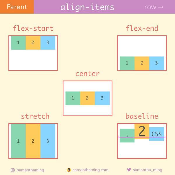
The align-items property aligns items on the cross axis. There are four values this property can take on:
stretch(default)Flex items stretch to the height of their parent container. This height might be determined by either the height of the talles item or by a size set on the container.
flex-startThe items line up at the start of the the cross axis (top of the container for a row, left of the container for a column).
flex-endFlex items are aligned at the end of the cross axis (bottom of the container for a row, right of the container for a column).
centerFlex items are centered along the cross axis.
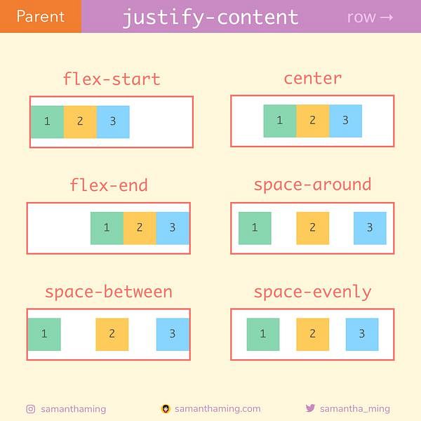
The justify-content property is used to define how the browser distributes space between and around flex items along the main axis of their container. This property can take on one of six values:
flex-start(default)Items are lined up at the start of the main axis, putting the remaining available space after the last item in the container.
flex-endItems are lined up at the end of the main axis, putting the remaining available space before the first item in the container.
centerItems are centered on the main axis, evenly distributing available space before the first and after the last item.
space-betweenItems are evenly distributed in the flex container. The first item is placed at the start, the last item is placed at the end, and the remaining items are evenly distributed between them.
space-aroundItems are evenly distributed with equal space around them. The space between the items and the edges of the container is half the size of the space between items.
space-evenlyItems are distributed with equal space around them. The space between any two items, and the space between the items and the container edges, is the same.